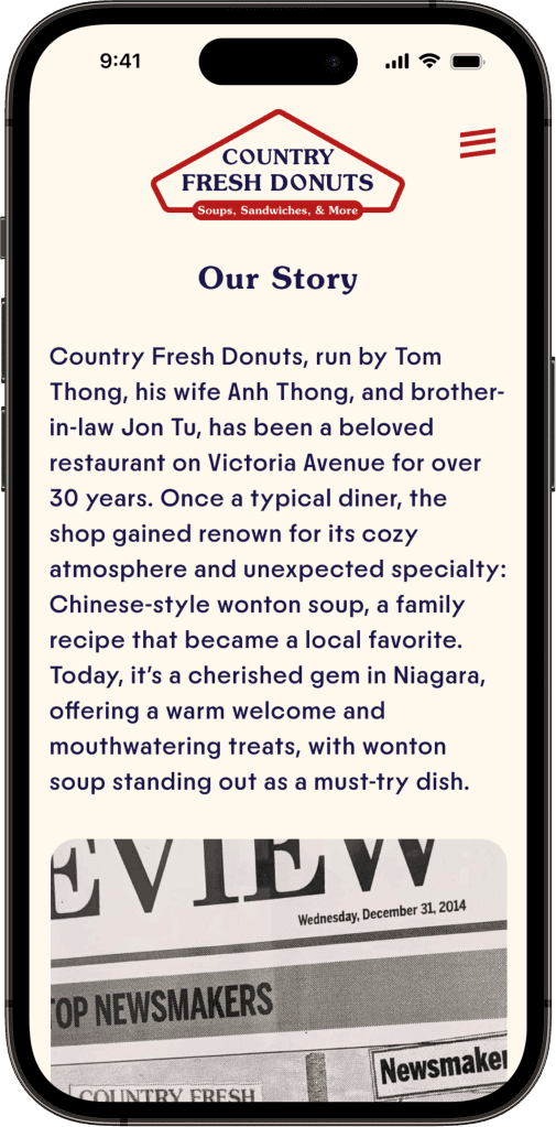
Country Fresh Donuts
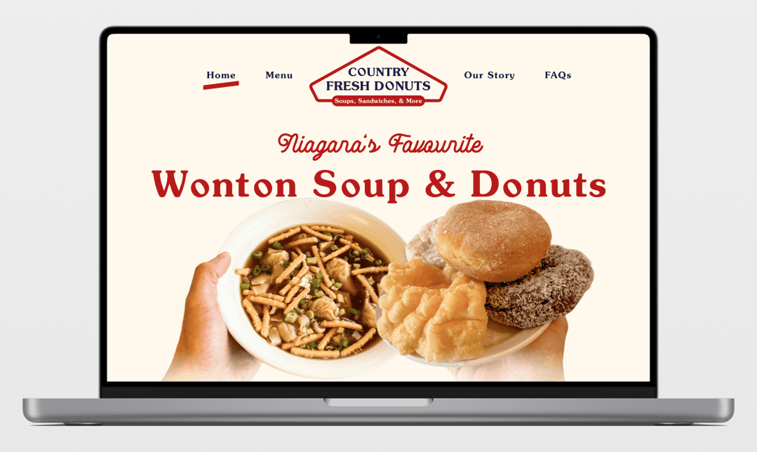
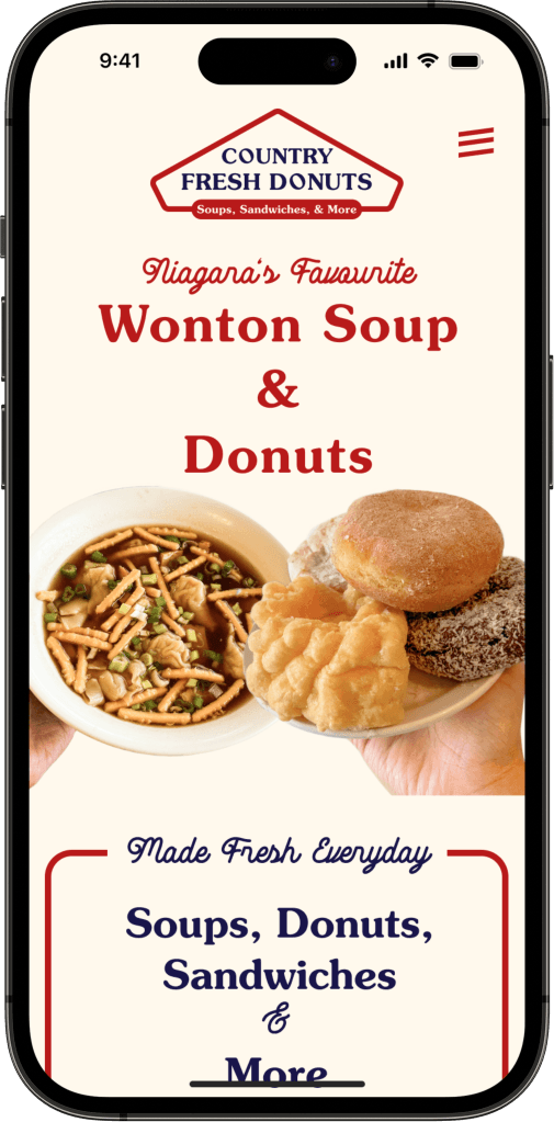
A new responsive website for Country Fresh Donuts is a huge step forward for their online presence and branding.
Role
Product Designer,
Researcher
Tools
Figma, Dovetail, ChatGPT
Timeline
February - April 2024
Skills
User Research, Sketching, Wireframing, Branding, Prototyping, Usability Testing
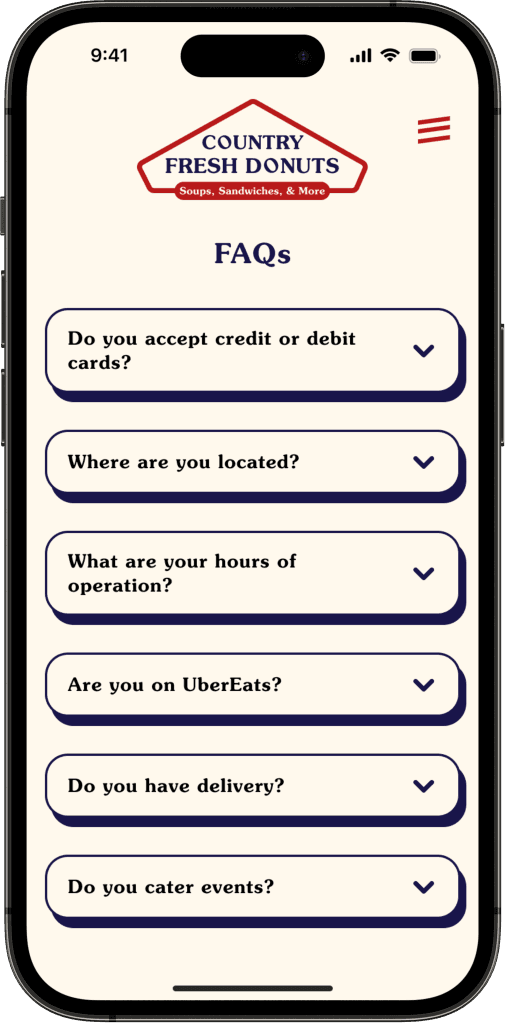
On top of their need for a website, Country Fresh Donuts noticed that their customers repeatedly came with questions and they wanted a place to direct them.
Country Fresh Donuts has a limited social media presence with little activity. Being near a tourist hotspot like Niagara Falls, a website would greatly benefit their current customers and attract new ones while building its brand identity.
Through several collaborative meetings with the client, a responsive website and brand identity was created for Country Fresh Donuts.
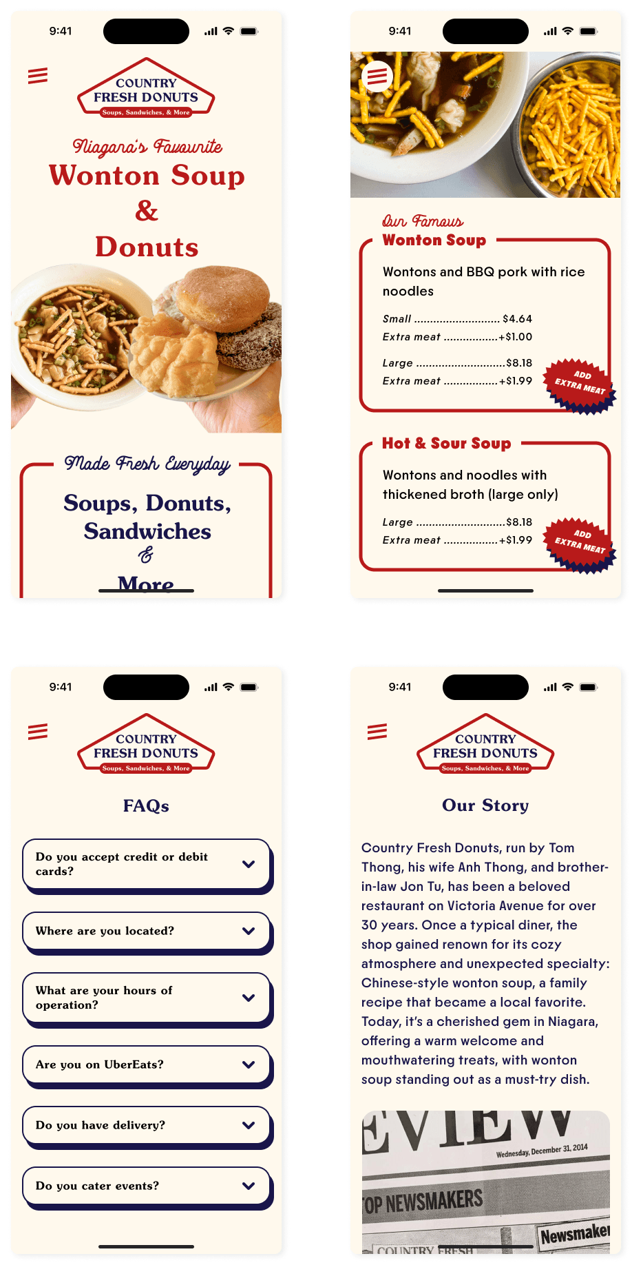
The content strategy highlights their unique offer of wonton soup and donuts, their local impact, and much needed answers to frequently asked questions.
RESEARCH
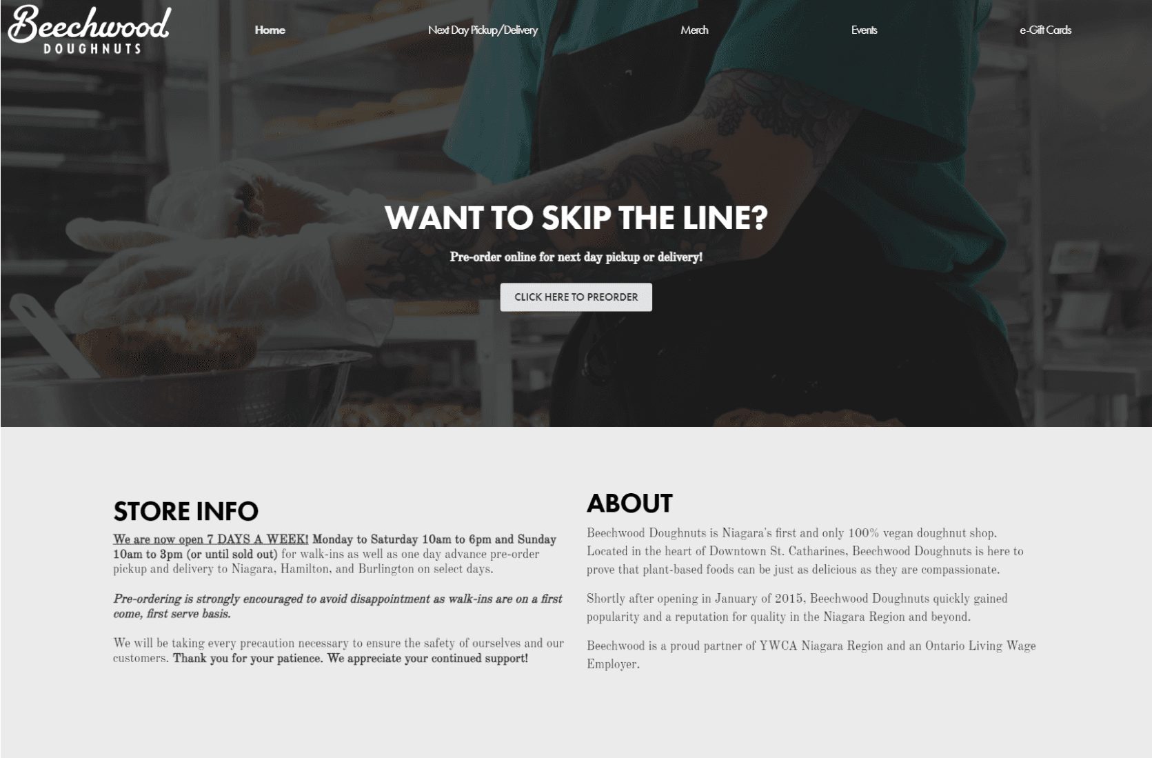
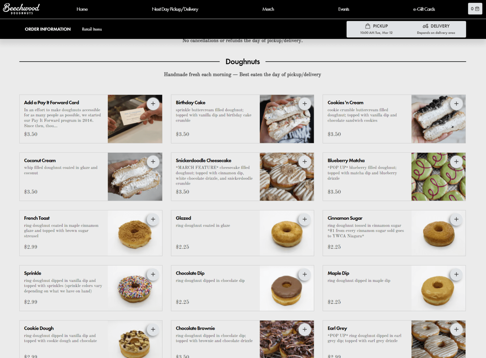
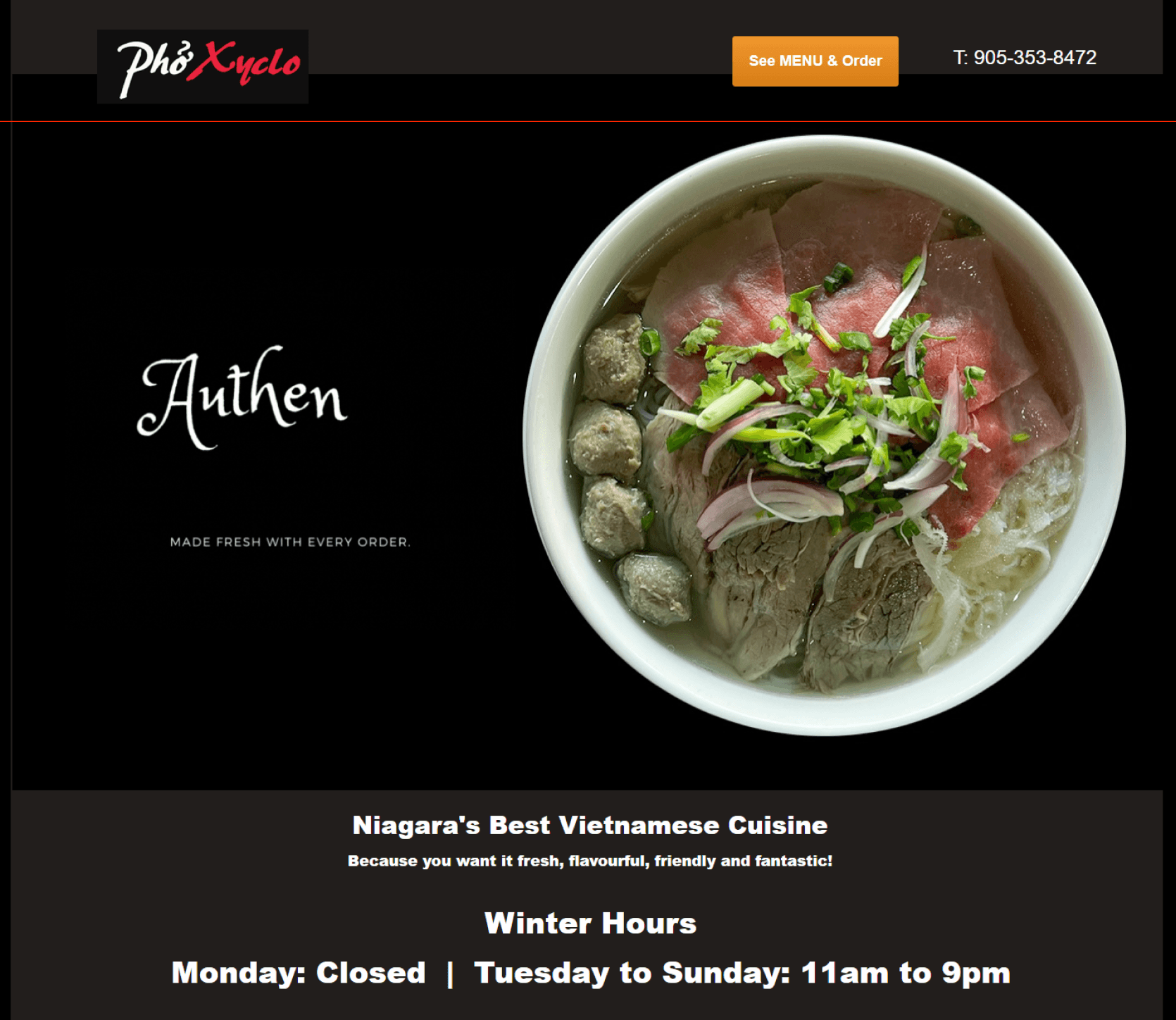
A competitive analysis shows that there are local restaurants in Niagara Falls with similar menu offerings.
However, none are as unique as Country Fresh Donuts.
A trendy local doughnut shop in Niagara Falls. However:
Greyscale colour palette has luxurious or serious tone that may look dissonant with selling doughnuts
A lot of body text with unclear hierarchy and difficult to read typography
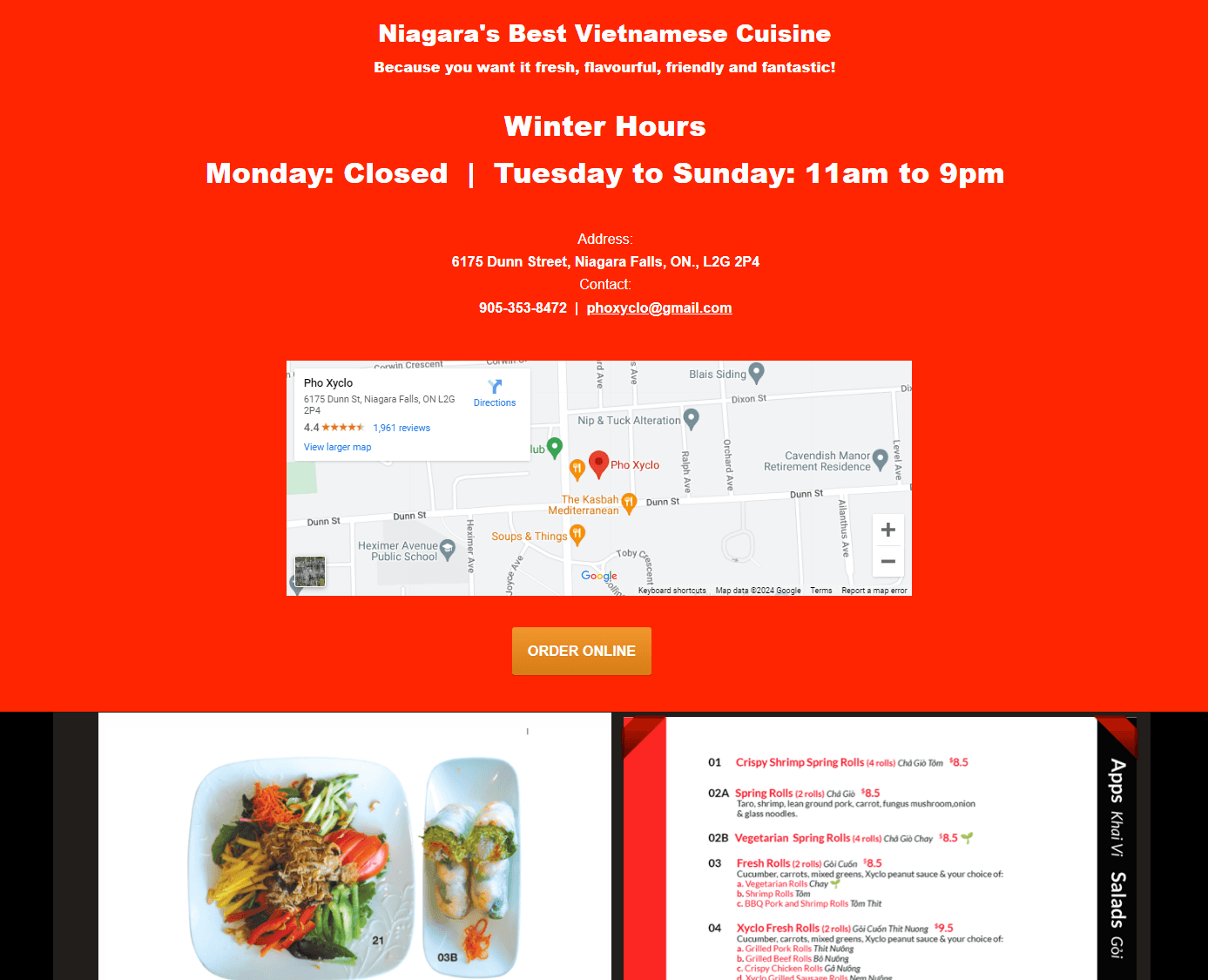
A popular Vietnamese restaurant selling soup in Niagara Falls. However:
Homepage has a lot of content including a PDF menu with no sense of information architecture or hierarchy
No dedicated about us page or FAQs page
Website is outdated and without strong branding
User interviews were conducted with 5 foodie participants.
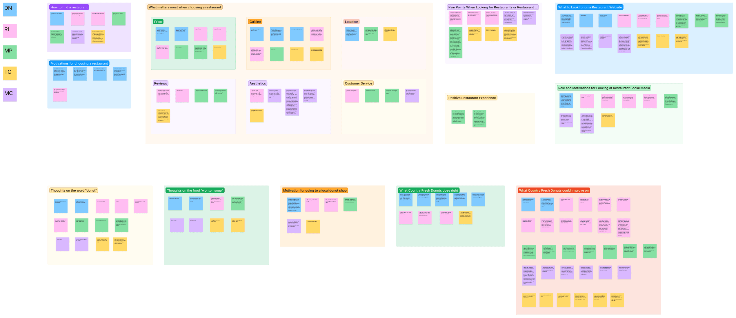
Insights were made using an affinity map to categorize the data. It revealed what is most important to them when deciding where and what to eat.

INSIGHT: Users weigh heavily on photos found on a restaurant’s social media and websites before visiting, which includes looking at photos of the food and the restaurant itself.
“Especially if I'm trying [to]... decide for a date night. I would look at their website just to kind of see. I want to see more pictures obviously with the food and the menu and… kind of pre-plan everything because I'm so indecisive.” - MC

INSIGHT: Users factor in the website as a part of their decision-making when finding a restaurant.
“Sometimes the websites are not as creative…, not as eye pleasing… Not great. Not great. I think there's just too much information on them.” - RL

INSIGHT: Users need to see the pricing of their food on their websites which is a major factor in their decision-making.
“I would like to see prices, and… some websites of food restaurants don't have the prices and I feel like that kind of hinders me in making a decision and trying to try the things out or booking in a reservation.” - MC
When asked what matters most when deciding to eat at a restaurant, several factors emerged.
80%
said good food
Of course! Specifically taste, cuisine, portion size, and aesthetics.
80%
said pricing
They want to be able to fit their meal in their budgets when deciding.
80%
said restaurant aesthetic
Surprisingly the restaurant appearance matters a lot!
60%
said location
They want an easily accessible restaurant.
60%
said customer service
Customer service is a priority in their dining experience.
They want to remain relevant and stay up-to-date with today’s clientele.
Decrease the number of questions they receive on Facebook.
They want to remain profitable amidst rising costs of raw materials and ingredients.
Of course, they want to keep their customers happy!
DEFINE
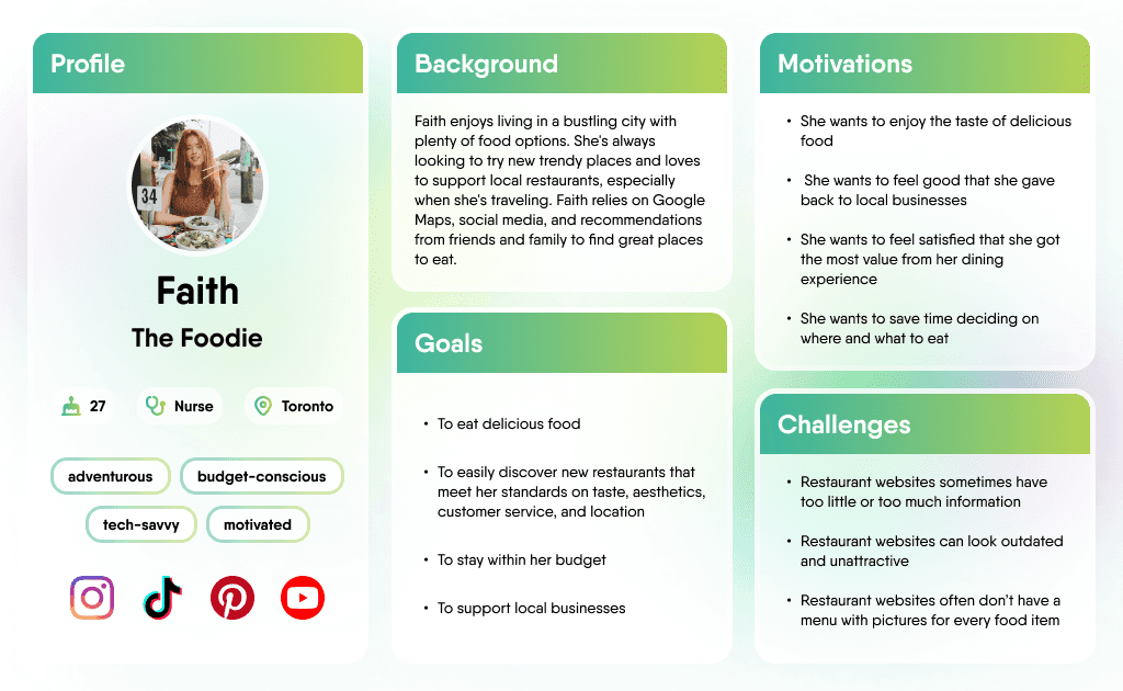
All the participants had similar goals when deciding on a place to eat. Together they make the persona, Faith. My design decisions were guided by her goals.
How might we organize and present information about Country Fresh Donuts so that it is visually appealing and easily accessible to customers?
IDEATE
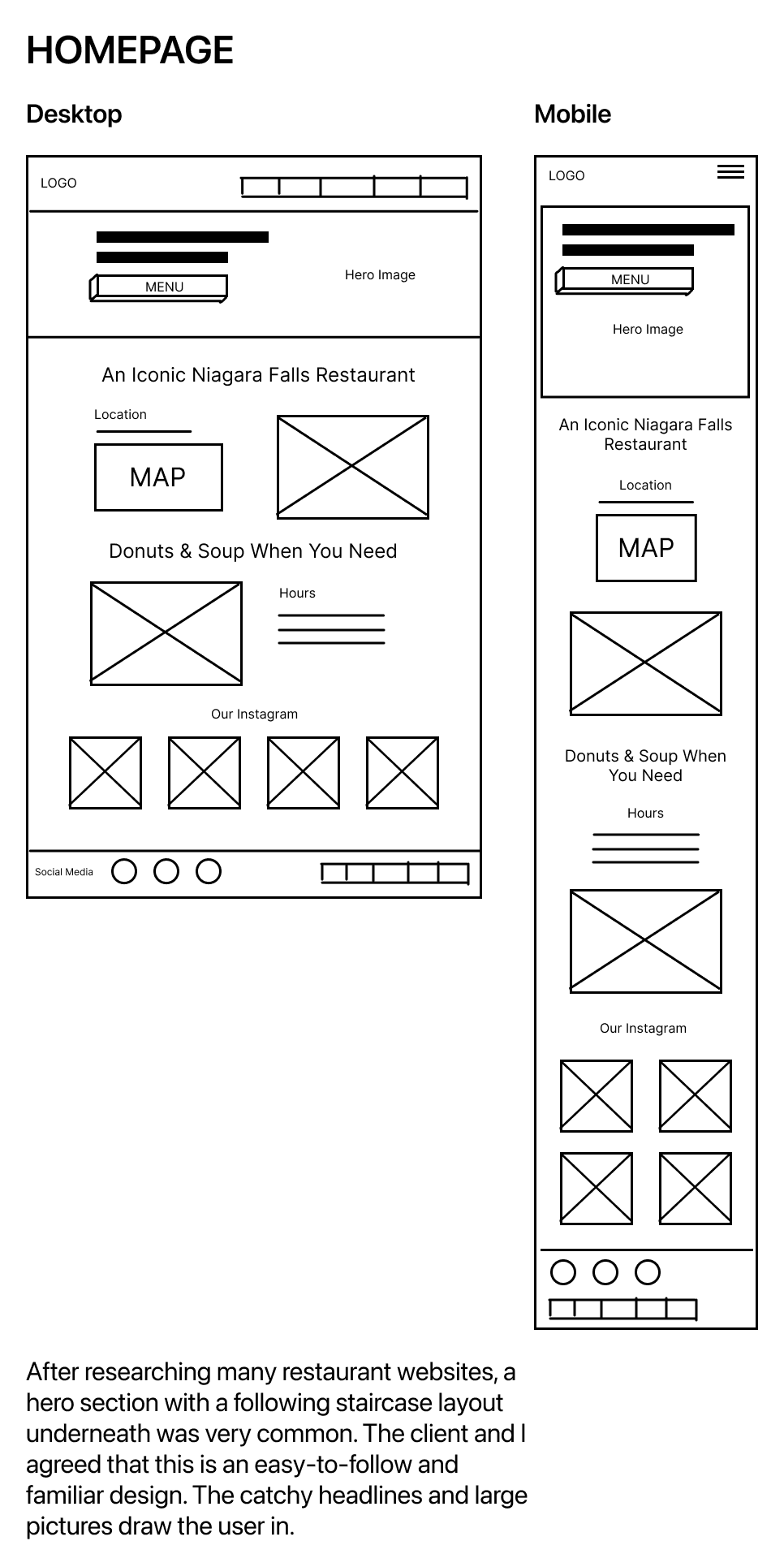
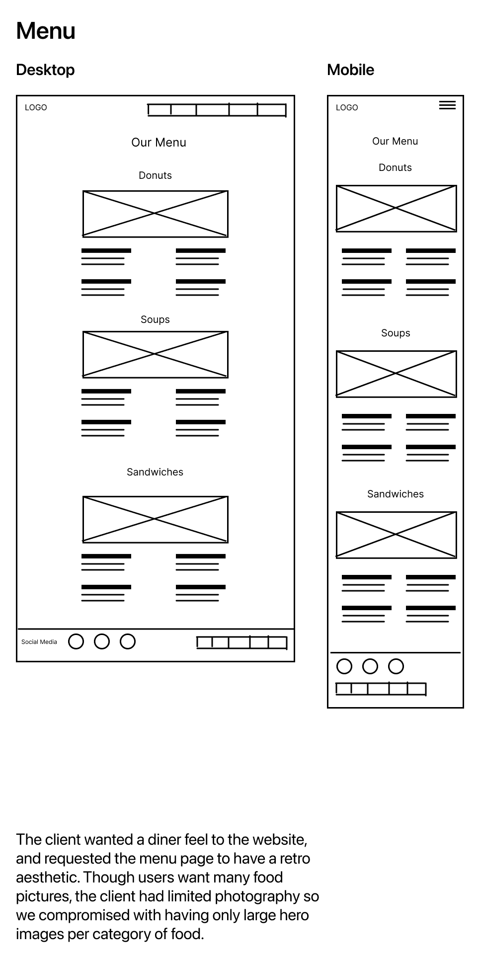
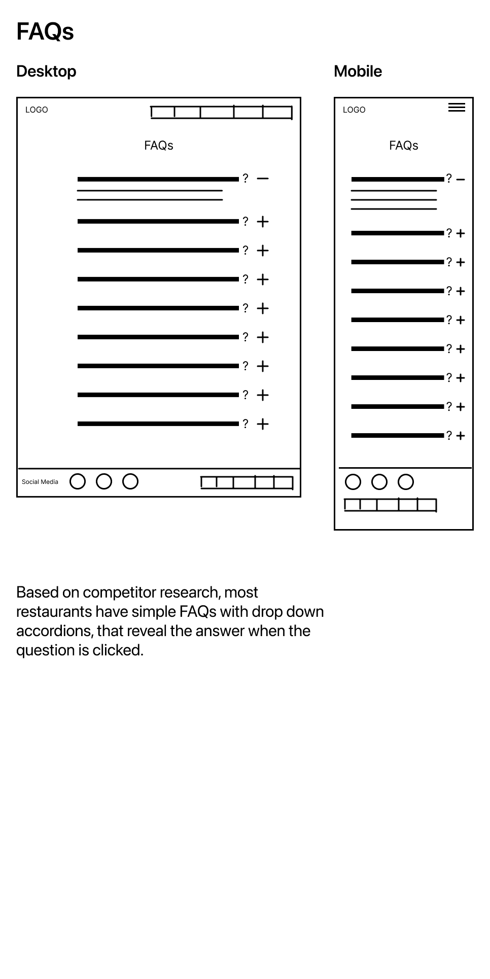
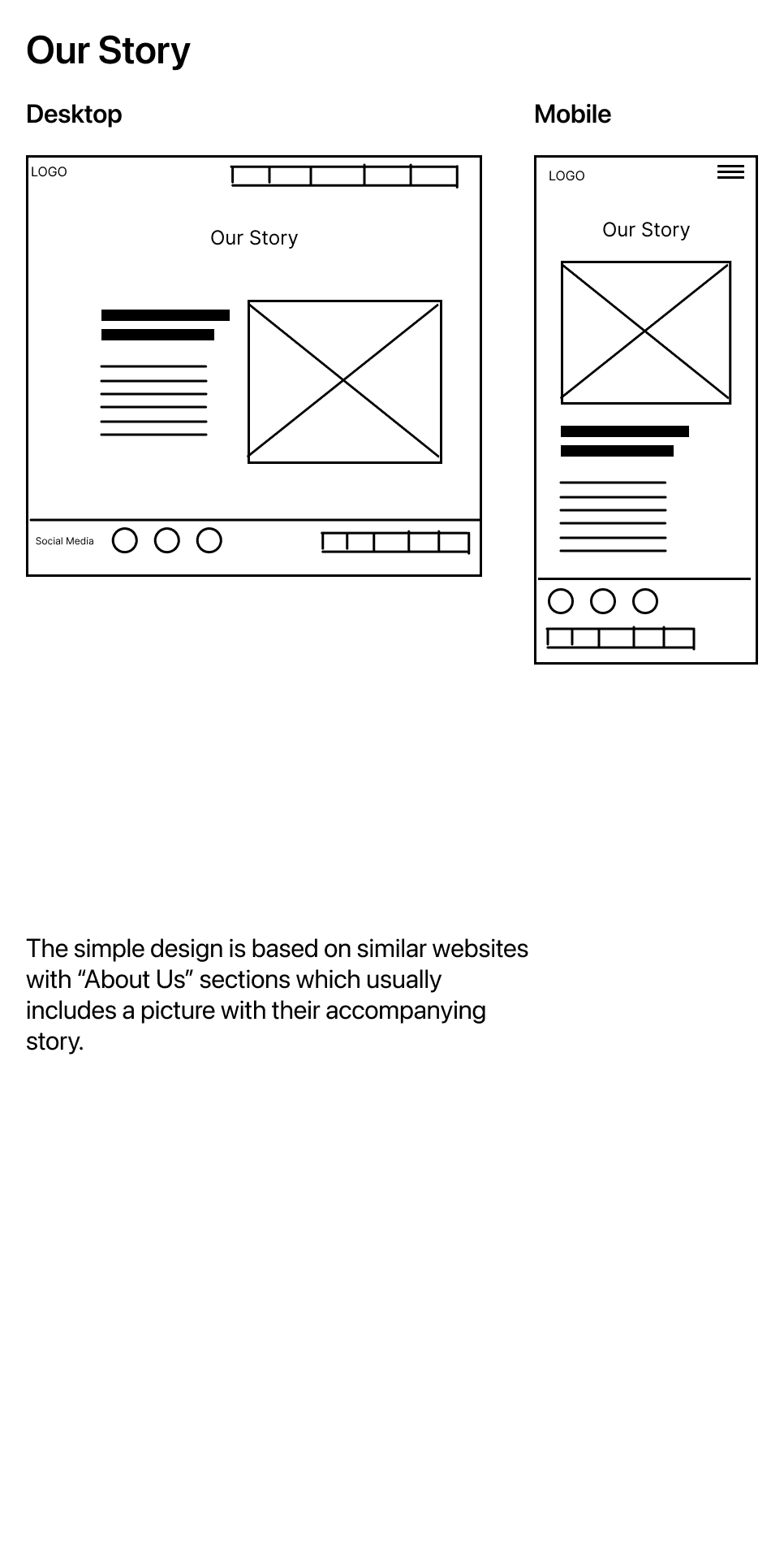
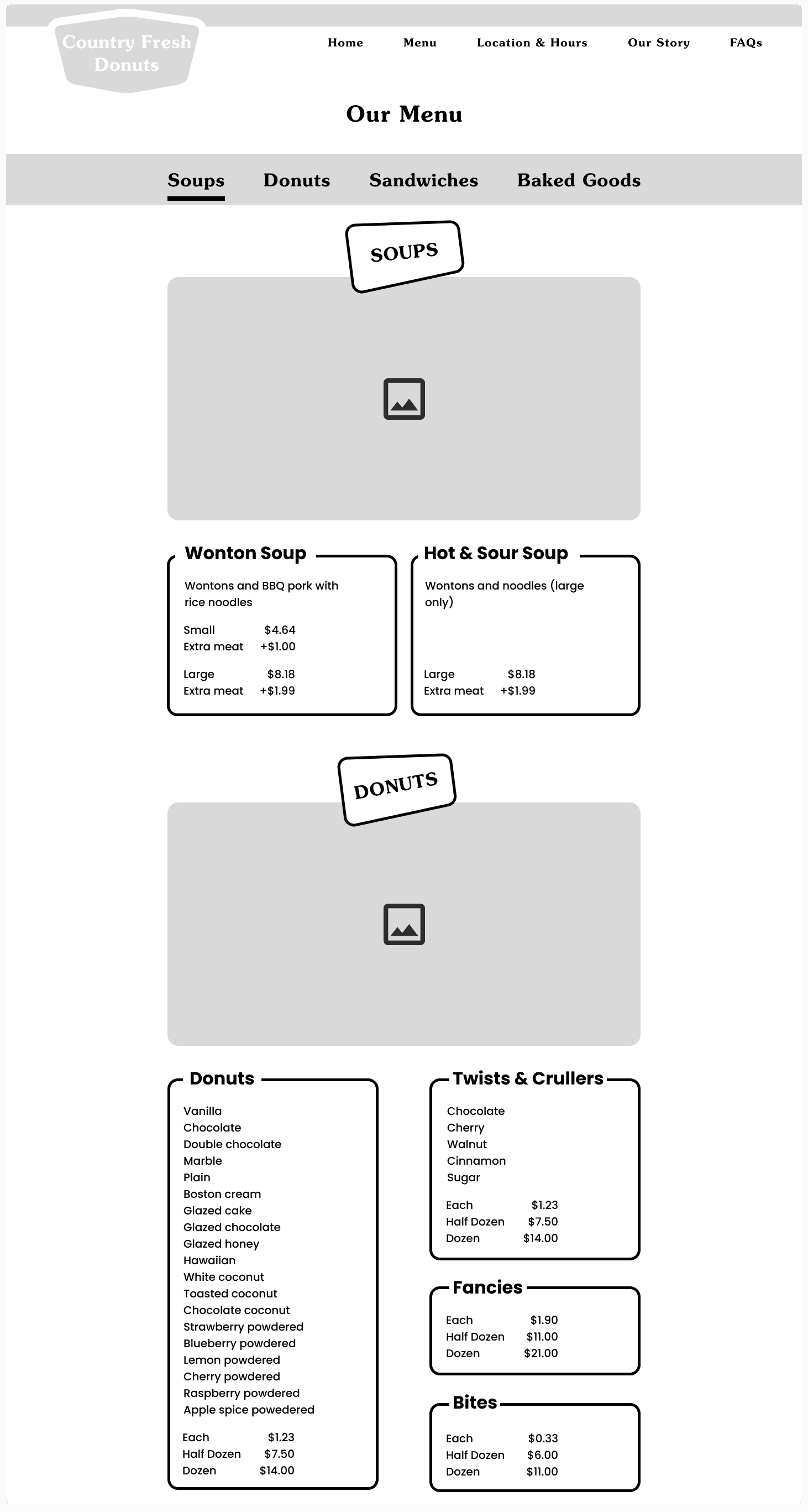
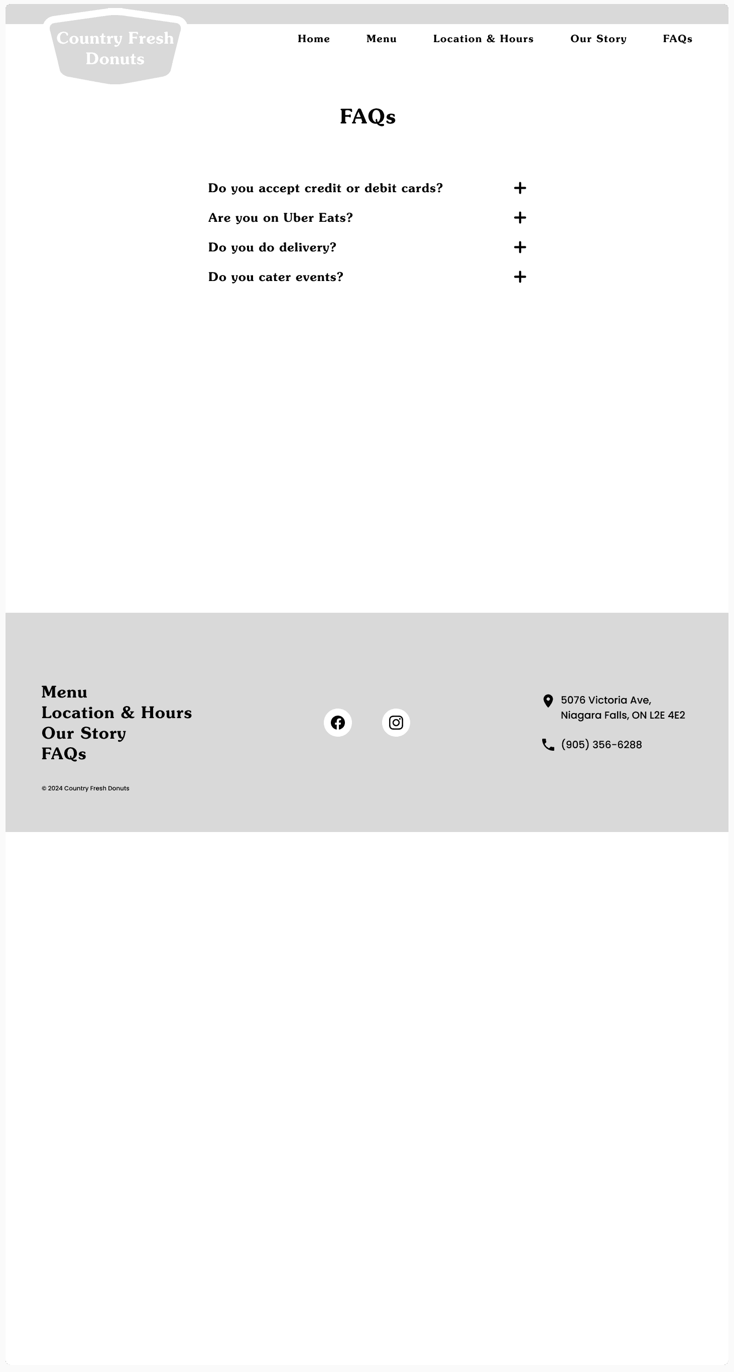
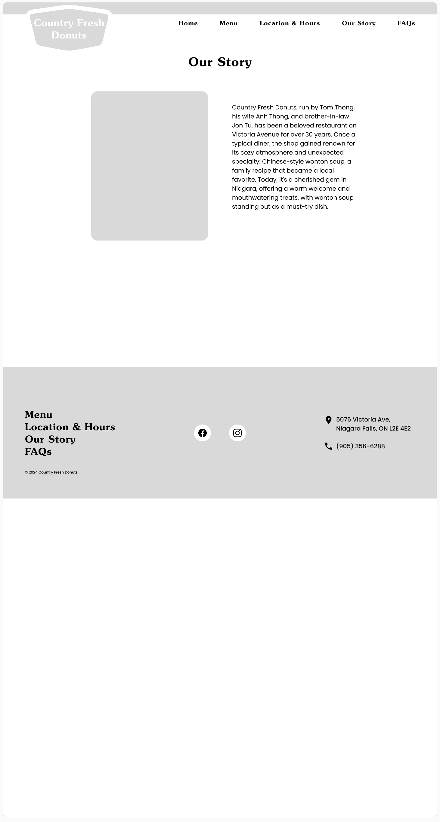
Considering the client’s needs and goals, as well as the insights discovered through user research I explored potential website designs through low-fidelity wireframes.
Different layouts were considered with the client and the following were selected based on content strategy and research on other restaurant websites.
PROTOTYPE & TESTING
I created a mid-fidelity prototype of the website to undergo the first round of usability testing for the purpose of validating our content strategy, information architecture, and wayfinding.
To validate the design so far, I conducted a first round of usability testing that tasked users to find information on the website, such as menu items, prices, and FAQs. Only one error was observed when one participant said an incorrect price for a food item.
Key findings and recommended changes:
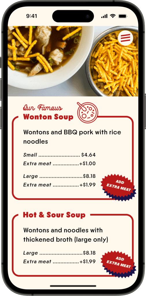
Moved the prices of food items higher and closer to their heading and above other content such as flavors for faster scanability.
All 5 participants said they mostly view websites on their phone; thus, informing that future tests should be using the mobile prototype.
BRANDING
Country Fresh Donuts had previously very little branding. Over several meetings with the client, we discussed their brand. We started by brainstorming brand values that aligned with their current business and identity.
We settled on:
Family
Tradition
Artisan
Nostalgia
Hardworking
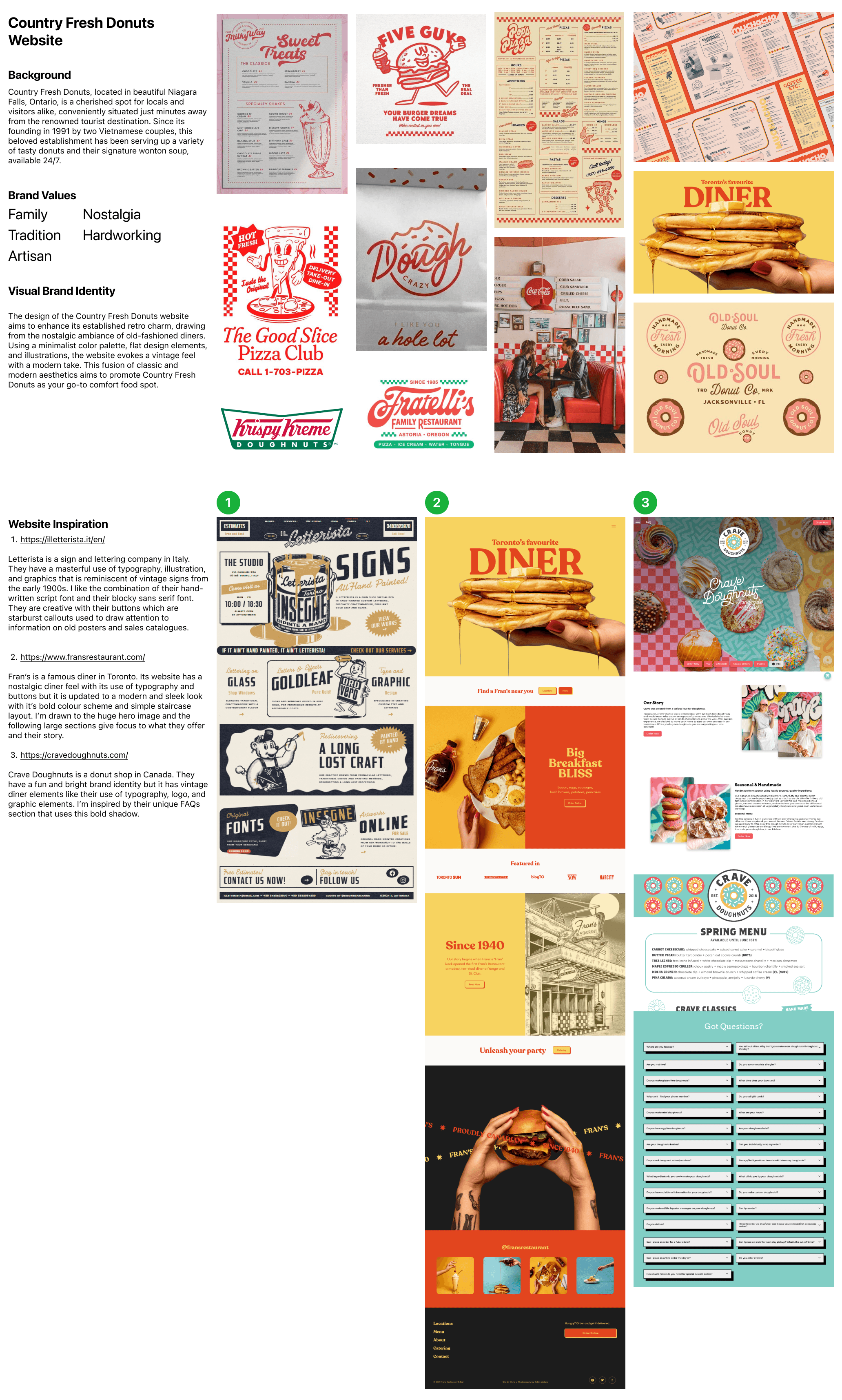
Moodboard
Next we discussed their vision for the style of the brand and website.
The client preferred a retro diner look with a local mom-and-pop business tone. They wanted to keep the original dark red as the basis of the colour palette.
With this information I created a moodboard with visual and website inspirations. The client was happy and satisfied with the vision we collaborated with together.
Logo
The client and I brainstormed potential logo concepts.
Our ideas were to include the wonton soup, donuts, the original storefront sign in a roof shape, and possibly incorporating Niagara Falls.
After sketching, digitizing, and selecting the strongest logos, I presented two options to the client while explaining the rationale behind each one.
Combines a donut inside a bowl of wonton soup, while showing when they started.
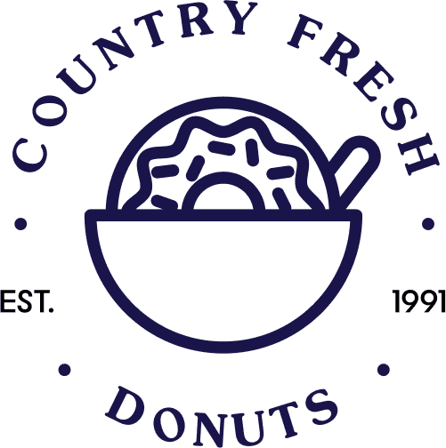
Modern and easily scalable. The words can be removed and still be recognized.
Client found it too modern and doesn't align with current brand identity
Takes their rooftop-shaped store sign and turns it into a logo, while showing what they offer.
May not be scalable, but future iterations could be
Familiar to the client and customers
Aligns with current brand identity, and the client was happy!
That's what matters, right?
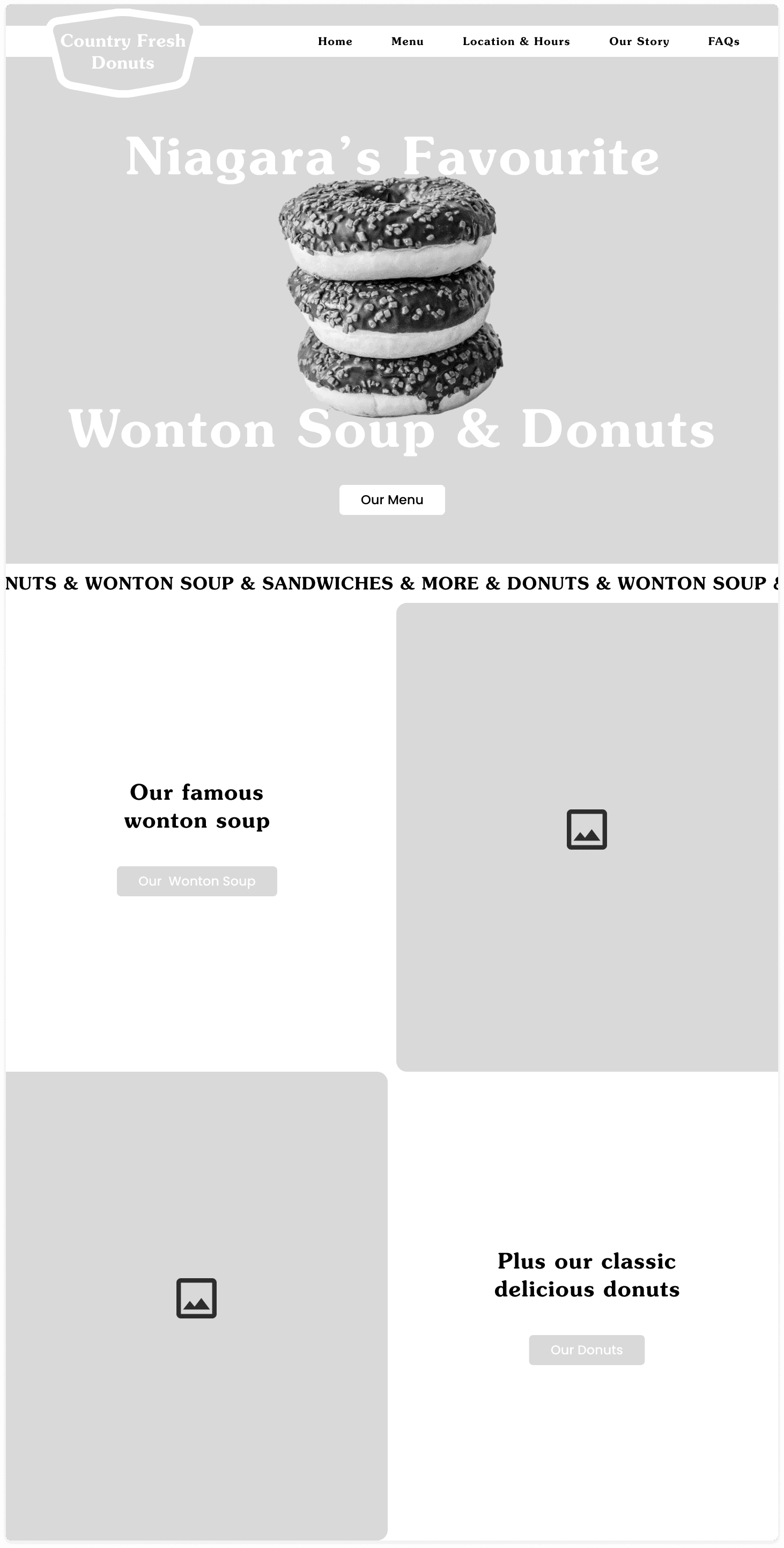
The collaborative effort into the branding was applied to the first iteration of high-fidelity wireframes.
The strong red outlines, varying fonts from script to serif to sans serif, simple colour palette, starburst callouts, and bold shadows aim for nostalgia.
Taking inspiration from a a diner menu, the border outlines for food categories is perfect for organizing information.
Before usability testing, I conducted a Five-Second Test to determine the effectiveness of the homepage. I asked the users to close their eyes and then open them and view the homepage in 5 seconds. I then asked them a series of questions.
100% of participants remember seeing a picture of the family or owners
83% of participants remember seeing soup
67% of participants remember seeing donuts
50% of participants had the impression of a homey, retro, family-owned business
Since this website doesn't have complex task flows, the test revolved around wayfinding and information gathering, so I sent them on a scavenger hunt!
Find the price for wonton soup and a dozen donuts
Task completion:
100%
Number of Errors:
1
Avg. Time on Task
0:38 secs
9.91
6.83
Find if they take credit or debit cards, and where they are located
Task completion:
100%
Number of Errors:
5
Avg. Time on Task
0:34 secs
9.96
6.33
Find the story of the owners
Task completion:
100%
Number of Errors:
0
Avg. Time on Task
0:13 secs
10
7
Oh no! There's a few errors.
The error in task 1 was due to a participant encountering a dead link that wasn't yet interactable on the prototype. Surprisingly the 5 errors in task 2 were due to the participant not knowing what "FAQs" meant.
User understanding of "FAQs" needs to be tested further with more participants to see if this is common before I change it.
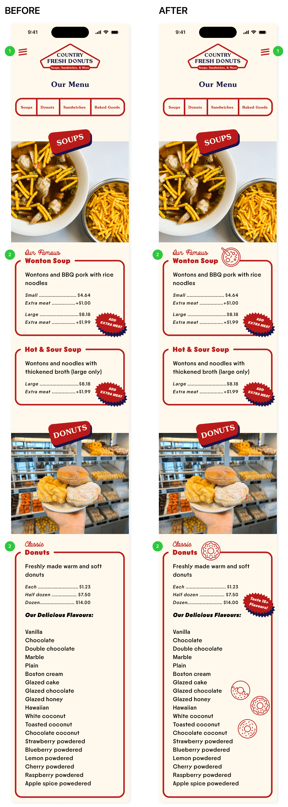
Moved hamburger menu to top right since most people are right-handed.
Created more illustrations to give delight and interest when users are scrolling through a long menu. I also added more starburst callouts to drive more attention to the donut flavours.
Through several collaborative meetings with the client, a responsive website and brand identity was created for Country Fresh Donuts.
The client was very satisfied with the new branding and website. Additionally, the users found the website to be straightforward and would be more likely to visit the restaurant.
Next steps include adding more illustrations, especially in the menu to create more engagement in a long page. With additional time, animations would be included to create more visual interest and modernization.
Close collaboration with the client are required to ensure that planning and strategy are effective, and that their needs and goals are met
Navigating compromises is crucial to client satisfaction
Take time with research and iteration to find what works best and looks best for your client
Branding is challenging because you need to ensure their identity is completely represented
